Mobile Map Service — Mobile-first UX for a spatial product
Designing a cross-platform map application used by ~10,000 users
Role: UX/UI Designer (sole designer) / CGI
Client: NDA
Duration: June 2021 – January 2024
Focus: Mobile-first UX / Interaction design / Product design / Prototyping
Impact
Led UX and UI design for a map-based product used by ~10,000 users across mobile, tablet, and desktop
Enabled a shift towards mobile-first usage by designing interaction models optimised for field use and smaller screens
Improved usability of complex spatial tools through clearer interaction patterns and visual hierarchy
Established scalable mobile interaction patterns and navigation structures supporting continuous product development
Delivered a consistent cross-platform experience across devices and contexts of use
The redesigned application was successfully released to app stores
Received strong feedback from client and development teams for usability improvements and collaboration
Overview
The project focused on modernising an existing map service used by landowners and other stakeholders to access spatial information and manage their land, while shifting development towards a stronger mobile-first experience.
The service needed to support both detailed planning on larger screens and efficient mobile use in real-world environments, including outdoor contexts where users interact with the product in the field. The work aimed to improve usability, clarify complex functionality and enable more effective mobile workflows.
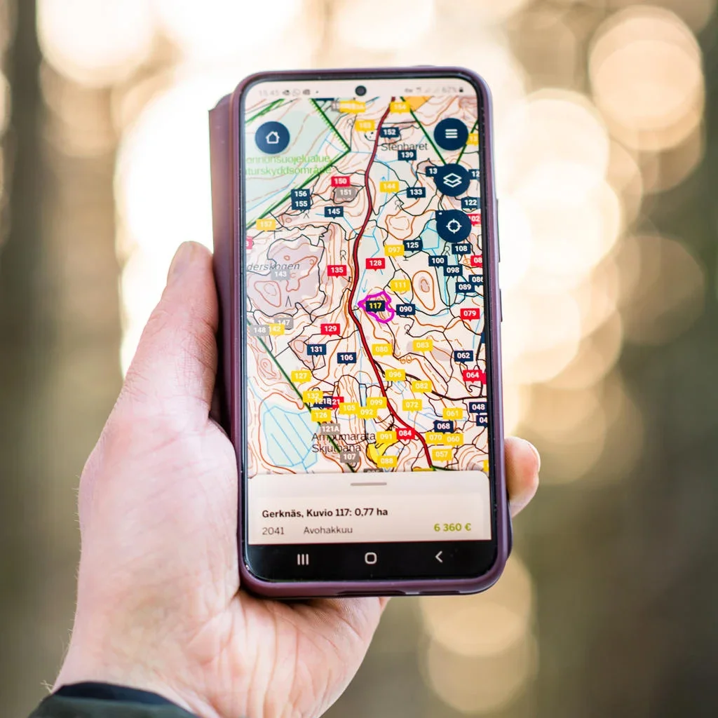
Image showing the publicly available application. Internal design materials cannot be shared due to NDA.
Challenge
The service needed to support complex spatial interactions on small screens while remaining usable in outdoor environments. The interface had to work with visually dense map data, where UI elements needed to remain distinguishable from detailed background layers.
Requirements were often evolving or ambiguous, requiring exploration of multiple design directions and continuous alignment with stakeholders while balancing usability, technical constraints, and business goals.
Key design decisions
Design work focused on making complex functionality usable in mobile contexts. I explored multiple interaction approaches for key tools and worked closely with stakeholders to evaluate alternatives.
Key decisions included:
Exploring alternative interaction solutions to support stakeholder decision-making and identify scalable solutions
Establishing clear visual hierarchy and distinction between UI elements and detailed map data
Applying client brand guidelines while improving usability, consistency, and clarity of the interface
Designing a custom icon system to improve tool recognition, reduce ambiguity, and create a coherent visual language
Approach
Defined core interaction flows and navigation structures
Extended the mobile-first experience across tablet and desktop contexts
Designed and iterated interaction and UI solutions in Figma
Created and evaluated multiple design proposals for key features
Collaborated closely with developers and product development management in a sprint-based process
Validated the product in outdoor testing
Outcome
Mobile, tablet, and desktop UX/UI designs
Interaction models for map tools and spatial workflows
Navigation structures and information architecture
Custom icon set and visual system components
Production-ready UI designs supporting implementation